FONCTIONNALITÉS
NOUVEAUTÉS POUR VOS PROJETS
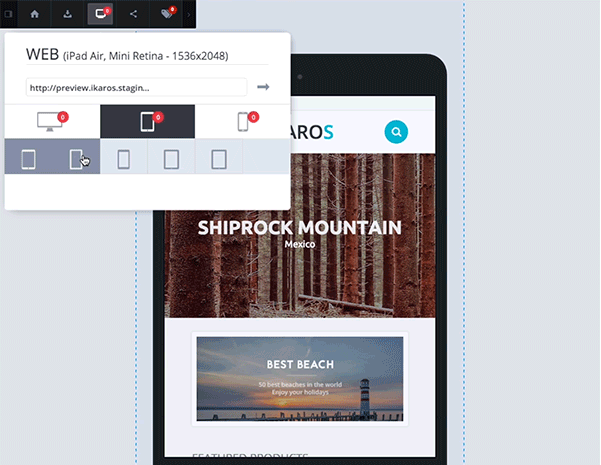
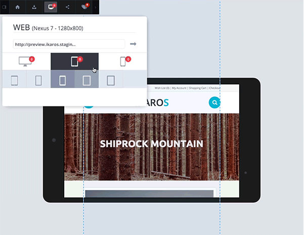
RESPONSIVE
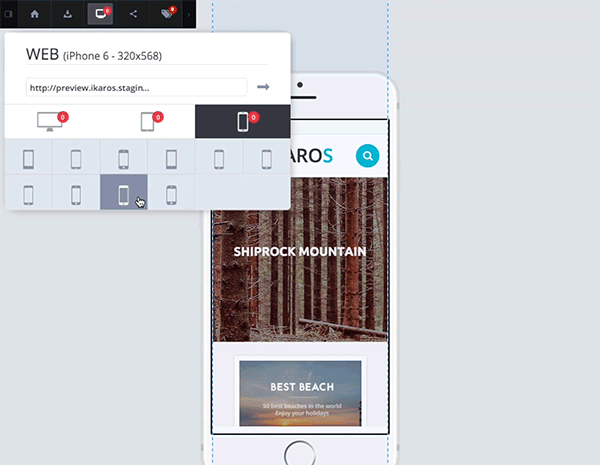
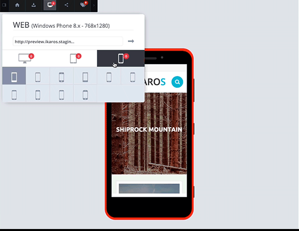
Manage all the responsive's components
When a new project is created for the web part, the "Device(s)" feature allows you to test all your website according to different responsive versions.
There are three types of devices: desktop, tablet and mobile.
- 27' screen
- 24' screen
- Large desktop (landscape) 1680×1050
- Small desktop (landscape) 1280×1080
- Netbook (landscape) 1280×800
- Tablet landscape 1366×768
- Tablet portrait 768×1366
- Ipad landscape 1024×768
- Ipad portrait 768×1024
- Iphone landscape 480×320
- Iphone portrait 320×480
- Iphone retina landscape 960×640
- Iphone retina portrait 640×960
- Windows phone 7.x landscape 800×480
- Windows phone 7.x portrait 480×800
- Windows phone 8.x landscape 1280×768
- Windows phone 8.x portrait 768×1280
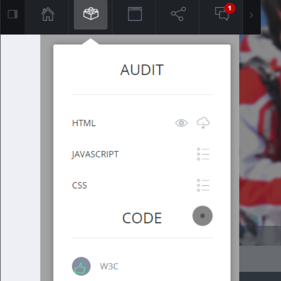
OTHER FEATURES
Find the other features of Preview.
-

-

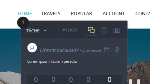
NOTIFICATIONS
Depending on your role, you need to be notified quickly on the changes occurred
-
-
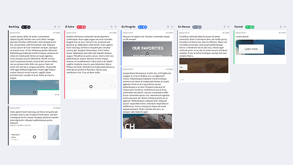
KANBAN BOARDS
Kanban boards serve to visualize the evolution of the work units in production process.
-
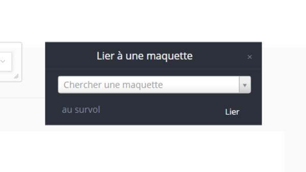
PROTOTYPING OF DESIGNS
Validate and close a discussion, making it possible for your teams to approve your work faster.
-
-
-


Comments: no replies